Every weigh-in on the chart, and every food behind a macro
My Journey used to average your days into buckets before drawing them. It now plots every measurement you took. And tapping a macro on Home opens the foods that built it, biggest first.
Weight does not move in a line. You stand on the scale on a Tuesday and it says one thing. You stand on it on Wednesday, having done nothing differently, and it says something 900 g away.
A chart exists to let you see past that. The old one did it by averaging your days into buckets and drawing the buckets. That hides the noise, which sounds like the right idea, until you notice it also hides you. A mean of means is a number nobody recorded, on a day that did not happen.
So the chart draws your measurements now, and puts the trend on top of them.
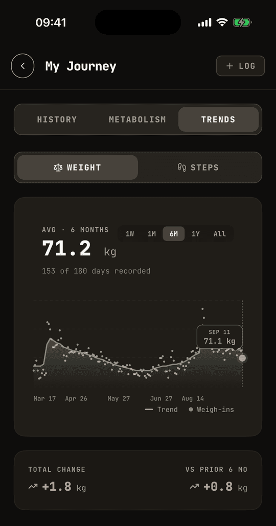
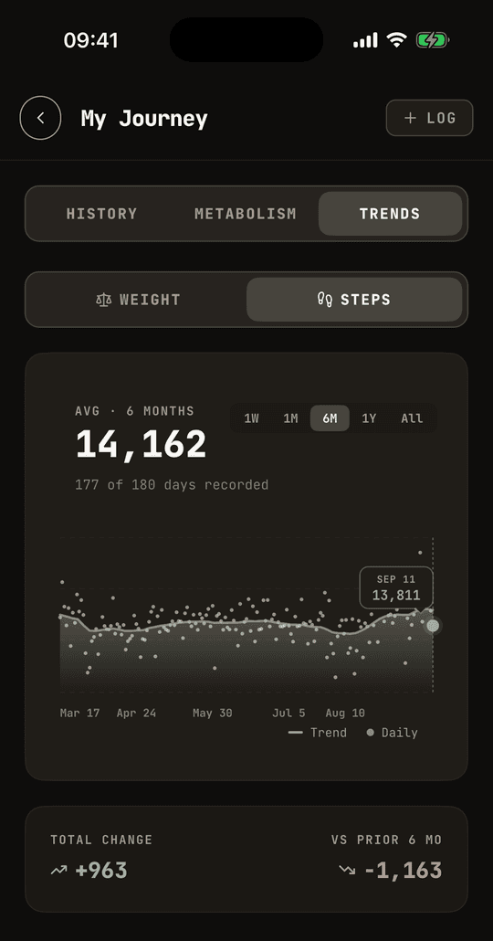
Every dot is a morning you weighed yourself. The line is the trend through those dots. You can see both at once, which means you can see the thing that actually matters: how far your days scatter around the line, and whether the line is going anywhere.
The trend stops changing when you change the range
This is the part that took the longest to get right.
The trend is a smoothed version of your measurements, with a 7-day constant. The obvious way to build it is to take the days in view and smooth those. Do that and the smoothing has no run-up: it starts pinned to the first point on screen, and every value near the left edge is dragged toward whatever that one day happened to say.
Worse, the trend for a given date then depends on the range you picked. The same Thursday in March reads one way on 6M and another way on 1Y, because a different day was sitting at the left edge each time. A chart that gives two answers for one day is not worth reading.
So the smoothing runs across your whole history first, and the visible window is a slice of that result. March reads the same on every range, because it is the same calculation.
A week is too short to have a trend
Ask for 1W and the trend line disappears. Only your weigh-ins are drawn.
A 7-day smoothing constant cannot say anything useful about 7 days. The line collapses to something close to a flat mean, and then it sits there reporting a number you never recorded, on a day whose real measurement is drawn a few pixels away. Better to show you the four times you stood on the scale and let you read them.
Steps are measurements too
Steps used to get bucketed the same way, so a fortnight of walking turned into a tidy line that was never your step count on any particular day.
They now plot as measured, one point per day, with the same trend through them. The 7-day constant suits steps for its own reason: a week is exactly one cycle of the pattern, so the weekday-weekend swing averages out instead of reading as a trend that keeps reversing.
Two days do not make the cut. Today, because your phone has only counted part of it. And any day under 1,000 steps, because that is a sync gap or a day your phone stayed on the table, not a day you walked 400 steps. Leave them in and they drag the average down for reasons that have nothing to do with you.
The chart says how much it knows
Under the average, the chart now says how many days it is actually built from. 153 of 180 days recorded, for the weight chart above. 177 of 180 for the steps.
An average over 153 days and an average over 6 is the same number in the same type, and you should not have to guess which one you are looking at.
The denominator stops at the age of your account, so a new account on All sees 5 of 40 rather than 5 of 1,825, which would only be telling you about the range.
All goes back five years
All used to stop a year back. It now reaches five, so the chart starts where your first weigh-in is rather than where the range ran out.
Tap a macro, see what built it
Same problem, one screen over. Home tells you 301 g of carbs. True, and not much use on its own. 301 g of what?
Tap Fat, Carbs or Protein on the Home card and the day opens up. Every food that contributed, biggest first, each with its share of the total.
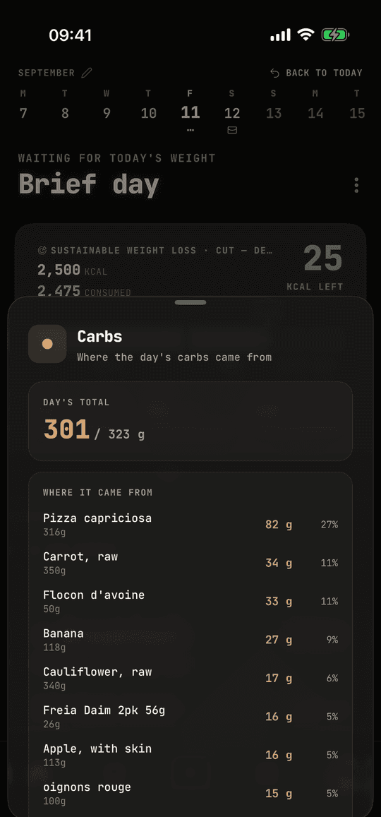
A few things had to be right for that list to be readable.
The same food logged twice is one line, not two. Rows group on the food's name and its unit together.
Keeping the unit in that key is deliberate. "1 egg" and "50 g of egg" stay apart, because adding them gives you "51" of something that does not exist. But the unit itself gets normalised first: foods arrive from the food database, a barcode, a photo and the assistant, and those pipelines disagree about whether it is "g" or "grams". Left alone, the same food splits into two rows for no reason a reader could see.
Anything under 0.5 g is dropped, because a row reading "0 g" tells you nothing. That filter runs after the grouping, so two small helpings of one food still add up to a line of their own rather than vanishing separately.
And the total at the top is the day's real total, not the sum of the rows beneath it. Those rows dropped the crumbs, so they would come up a fraction short, and a number on this screen that disagrees with the number on Home is worse than a rounding error you never see.
Settings is not involved. Open My Journey, then Trends.